|
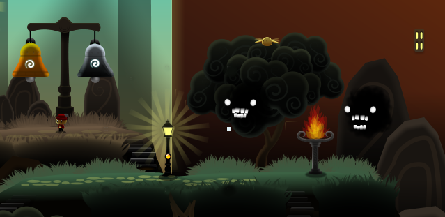
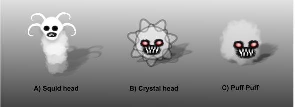
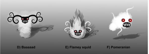
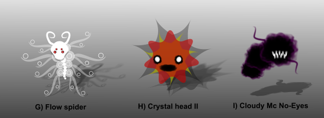
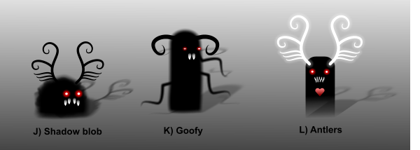
Above is a piccie of a couple of Minor Demons hiding in a tree and a rock. They can't harm you... directly. They whisper and chatter all kinds of unpleasant things at you, and often give clues to the rituals in the world by doing so. They also lie. I quite like them. There's something baleful and menacing about their eyes, and the slightly wonky teeth lend them a hungry, semi-British air I think works pretty well. So, this blog is about art. Failed art, in particular. My failed art, exclusively, in fact. I can't claim any great talent beyond sheer dogged tenacity and determination. I am not even half the artist of any I have had the honour to work with. To get to a point where I'm happy with my own art, both in form and function, is difficult, rare, and one of the things that leads to the colossal churn I experience during my working week. These Demons, in particular, have been particularly difficult to make, simply because they have to do so much, so subtley. What's that I hear you asking? 'How difficult can it be to come up with something you can put anywhere, seems menacing, chatty, and yet not corporeal enough to offer a physical threat?' Well, quite, I am afraid. And I can prove how hard I find it. I will now reveal to you the Gallerie Abominati that is: 'Dene's Demon Failures' Please note: some of the more generous among you may find yourselves saying, 'Oh, they aren't that bad'. Bless you. I shall buy you tea and absinthe should I see you in person. Perhaps even in that order. However, for the moment, let me tell you what I think of them. A) Squid Head He looks to me like Bjork had a bad hair day and turned up to the Oscars without brushing her teeth. Or sleeping. I love you, Bjork, but you really should have gone with your stylist's first suggestion and worn a fluffy Giraffe smock or something instead of dressing like a giant tampon. Next! B) Crystal Head I read far too much Lovecraft and similar horror written around the same period. Much is said about things that are 'unnamable horrors', and 'peculiar geometry'. I got it into my head that some shifting, ebbing, flowing, rotating set of geometric things with a face on would look good. I was quite wrong. It looks like someone put some stickers on a snowflake. Grrrrrrrmelt. C) Puff Puff Did someone remove the head from a particularly evil Bichon Frise? Fetch! Go on! Fet... oh, you decided to empty the bin over the floor instead. I hate you, but can't bring myself to bake you into a pie you little sod. I shall name you 'Roadkill' and hope that Nomen est Omen. D) Baaaad In my head, I was trying to create a mighty, antlered non-corporeal-being; not quite a wisp-'o'-the-woods, but a malevolent nature-spirit. Instead, I managed to make a reject from Wallace and Gromit's casting sessions. He has no feet or hands, but, despite his disabilities still remains incapable of enflaming any kind of sympathy for his struggle. I want to buy him a beer just to see him try to open it. Baaaaathunk! E) Flamey Squid You know I mentioned absinthe before? Well this is what it does to you if you try making art while drinking it. Don't believe the hype, it doesn't make you more creative. It makes you less discerning. I actually thought this was okay until I woke up feeling like my tongue had been swapped with a slug. A fire with antlers extending out of its rear and a sticker for a face isn't a Demon, it's a symptom of Delerium Tremens. F) Pomeranian See, this one wasn't even named correctly. That isn't a Pomeranian. It's not even a Bichon. It's a cloud with tentacles and the damned face I used in countless other versions of Minor Demons. For some reason I was clearly thinking 'if a design is crap, reuse elements of it as much as possible until it's not crap'. It's a very John Cage approach to creativity. It also doesn't work if you have only a small amount of talent to start with. G) Flow Spider I quite liked Flow. I think other people liked Flow. Apparently I thought that if people liked Flow they'd like a Demon that was ripped directly from Flow's unique aesthetic. I added spider eyes, a spine, a pair of wonky horns and a skull-shaped face to give it form. Someone once said that 'Plagiarists copy, geniuses steal.' I think I have disproved this pithy aphorism. Plagiarists copy... then try to disguise the copy. Geniuses don't touch other peoples' ideas with a barge pole unless they can make them their own. H) Crystal Head II Um. Another Christmas Tree ornament. With staring eyes. I quite like the eyes, and the gaping maw. However, they clearly don't work with this format and I've actually ended up with something less than the sum of its parts (quite a feat considering how awful the parts are for the most part). I didn't know that was possible. I say to you - make a sticker of this abomination and place it somewhere prominent. Use it to remind yourself that bad design pushes and stretches the bounds of physics just as much as science. Next step CERN. I) Cloudy Mc No-Eyes See... I really like Alien. I love Giger's daring, sleek visions of feminine malice and semi-eroticised, airbrushed biomechanics. As far as my art is concerned though, apparently all I learned was that 'removing something's eyes makes that thing creepy.' Yes, yes it does. Sometimes. And sometimes it just looks like you hid a layer in Photoshop before exporting and forgot to re-enable it. On the other hand, this one did teach me that the black designs worked better for semi-obscuring Demons. Which led me to these... J) Shadow Blob This was my first attempt to change the physicality of Demons, rendering them a little less amorphous and - hopefully, by dint of this - more majestic. Instead, I ended up with the world's worst Halloween lawn-ornament. Can you imagine listening to anything this thing would say? Would you take it seriously? I certainly wouldn't. The fact that he looks like someone has pulled the wings off a big, toothy moth doesn't help: "I haff fecretf!' K) Goofy And apparently, much like the 'eye' thing above, I decided that too many teeth were reducing the purity of the idea, and that by only leaving two, I would improve things. I was wrong. He looks like he has lost his banjo. And he's sleepy. And his horns melted on a hot summer's day on the back porch in Georgia while his wife and sister (one person - thanks Bill Hicks) screams at him, asking if he's found a job yet. "Weeeeell'p. Nochyet. Ahwheeltho'. Tomorrer." Fat chance, freak. L) Antlers If black horns and a gassy body don't work, how about we swap the horns for white glowing horns and a body shaped like a specialist massage device? What can possibly go wrong? See, some of these elements work very well for the White Demon - the game's secondary character. However, removing the face, the ears and making it black just makes it look indecent. And potentially painful to use. Pain and Happy OutcomesAll of these were failures. What made them more 'faily' than necessary was that many of them made it into the actual game before I realised how bad they were. I put work into making tentacles wiggle, making antlers flap (yes, really) and many other things before I realised that I hadn't thought enough about form, function and context. These Demons need to be able to do the following things: - Hide in amongst other objects. Form and Context. - Hover in the air. Function. - Sit on the ground. Form and Function. - Talk. Function. - Scare you a little. Form. - Not look repetitive when reused. Form, Context If you look at many of the failure-Demons, they are either only going to work on land, don't really have mouths that can speak, can't do scary stuff like stare at you, are so specific that having two of them on screen would look ridiculous, or any other number of things that show I hadn't put enough time into the design stage. So, after considering all this, really thinking about what I did/didn't like, and what the Minor Demons needed to do, I did the following: - I took the eyes from H) which I thought were fairly menacing (Clive Barker's art taught me that white eyes in black surrounds can be creepy). - I took the body from C) but made it black, so it could fit in anywhere in my high-contrast scenes. It's less of a body and more of an interface between the Demon and the context. - Finally, I took teeth from the movie below, added a bottom set of teeth so the Demon could speak... and look menacing at the same time. 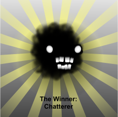 Here he is!
Finally, I hope my self-deprecating, bluntly cruel appraisal of my work amused you rather than just making you think I should do something else with my time.
23 Comments
|
AuthorFluttermind’s director, Dene Carter, is a games industry veteran of over 25 years, and co-founder of Big Blue Box Studios, creators of the Fable franchise for the XBox and XBox 360. Archives
April 2022
Categories |

